While discussing multiuser content with Yacco Vijn in a traditional Dutch restaurant in Amsterdam, I noticed that though I speak no Dutch, the noises of conversations and plates clattering around the restaurant were comforting and familiar. The experience of sharing a space with others was what mattered, regardless of the spoken language. This social activity drives people to restaurants, movie theatres, the ballet, sporting events, and even to quiet libraries (where individuals are at once alone and in a group).
I call the general motion and commotion of crowds "ambient human activity". I consider it highly significant to the individual experience, and quite missing from the experience of the web. On returning from Amsterdam, I decided to embark on the Ambient User Sound project, with the mission to explore ways to integrate ambient human activity into web content.
The idea for Ambient User Sound was very simple: play sounds in response to user activity much the way human activity creates sounds in a restaurant or library. The original concept gave sounds to the following actions:
- entering the page
- exiting the page
- clicking the mouse
- moving the mouse
Hence, when the user is alone, things are quiet; when there's a crowd on the page, there's a murmur of clicking and whirring. The sounds could be quite literal, resulting in something like an office environment. Or, the sounds could be interpretive, perhaps resulting in something quasi-musical.
I decided to use moock.org's homepage as a platform for the experiment because it generally has at least a few people on it at any given time. Also, the navigation panel would require lots of mouse movement and clicking.
Once the implementation was under way, I realized that I was tracking enough information about each user that I could also represent users visually. Each user's mouse pointer could be shown to other users. Again, the idea being that individuals accessing the content would get a sense of the collective experience. As a by-product of showing mouse pointers, individuals could also see what pages other users were accessing by watching the links they chose. I thought this would likely cause some people to follow others, creating visible trails to popular content. (Incidentally, this would probably be useful for usability studies with an administrator observing user activity.)
I tossed around several visual ideas at this stage. One which I like and still may do is the idea of a queue to a navigation panel. Suppose you have a navigation panel enclosed in a box with an entrance big enough to fit only one mouse pointer. With a little collision detection, it would be possible to force mouse pointers to enter one-at-a-time, so they'd have to form a queue to access the navigation panel. It would even be possible to allow them to push and shove each other around. Would the normal "no butting in line" etiquette apply?
In the end, I decided to interpret user's pointers as insect-like creatures. Here's a screenshot showing nine of them on the page.
Bugs turned out to be a decent metaphor. Mostly they flit around seemingly without purpose. But eventually they either: 1) roost while the user reads something on the page, or 2) head directly to a link. The links on the page seemed to take on the role of food or flowers. It's interesting to extend the analogy: mouse pointers need links to stay alive, and they pollinate and spread the links by using them. Death of a user, then, comes when they stop clicking, and death of a page comes when it stops being clicked.
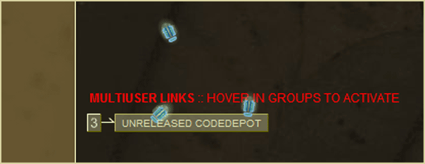
The bug pointers also have interesting collective behaviour. They tend to roost in groups and mostly move amongst each other. If one starts clicking, others tend to respond. I find you can even chase them around if you point to them. I wanted to encourage this collective behaviour, so I came up with what I think is the web's first "multi-user link". When three users point to the link, it activates. Groups of users waiting for the link resemble bugs swarming.

In the second version of Ambient User Sound, I added a larger flying insect that represents not individual users but the group of connected users. The butterfly continually moves to the average location of all users. This allows user activity to be perceived on both a macro and a micro level. Finally, I added food particles for each user's bug. When the user moves the mouse, it drops food, and the bug moves towards it.
Throughout the project, I made a calculated decision not to show each user his/her own bug representation. I felt it caused people to get unnaturally "lost in the mirror" by playing with their own avatar. I wanted to represent incidental user activity with as little intentionality as possible on the part of each participant.
Occassionally I leave my site running on my computer all day. I can walk around my house listening to people visiting. When there's a lot of noise, I find myself drawn to investigate what's going on, almost as if there were a crowd on the street outside my door.
Ambient User Sound is only a starting point; there's an absolute ton more to explore. For example, it would be nice to portray age (time on the page or number of visits) by evolving the user's bug (metamorphosis).
For future reference, some key concepts in multiuser content that emerged from the experiment are:
- User representation - The user's presence is represented in the content. For example, the bugs in Ambient User Sound.
- User transformation - The user's presence permanently changes the content. For example, wearing out a button or treading a visible path to a link.
- User contribution - The user can actively add to the content. For example, by drawing graffiti, or by extending the virtual world as is possible in MUDs.
- User interaction - The user can communicate with other connected users on some level. Chat is the most obvious example. The multiuser link in Ambient User Sound is a more spatial example, as is combat in games like Quake or Warcraft.
- march 25, 2002: posted.

