| WEB DESIGN LECTURE NOTES |
| WEEK 4: PRODUCTION PRACTICES, AND MORE HTML |
a broader perspective: website production
here we are in week four, and by now you've learned many of the fundamental
skills you need to make web pages. what you haven't learned yet is how
to make web sites. a single web page is usually a fairly self-contained
object; a website, on the other hand, can comprise hundreds, often thousands
of individual images, html files, documents, code snipits, and source materials.
producing an entire website successfully (and with the least amount of hassles)
requires thorough planning, organization, and proper management of all the little
pieces, or "assets" used on the site. we'll consider those aspects
of site production during the first half of this week's lecture while exploring
how you might approach creating a fairly small static site for a corporate client
(the kind of site that is often called "brochure-ware" because it's
simply an online version of the company's basic marketing materials). in the
second half of the lecture, we'll examine more advanced uses of the table tag,
and i'll introduce you to frames.
note that the guidelines for web project management described here are most applicable to a small freelance situation. web production practices can vary greatly from agency to agency, so if you're planning to seek employment in the web industry, expect to see much more involved, and possibly quite different approaches to large-scale site construction. that said, the following info should give you an idea of the issues you'll need to learn to handle if you intend to create sites for a living.
brainstorming with the client
start by having a few very practical meetings with your client to establish
the "scope" of the site you're going to build. what kinds of things
will be included? explore anything that comes to mind. take a look at sites
in the client's industry for comparison. see what the client thinks of the competitors
sites. have the client throw out as many ideas as they can of what they'd like
to see on their site. then suggest more yourself. consider some general categories
of content--things like press releases, product info, contact info, investor
content, company history, profiles of key staff, employment opportunities, product
support faqs, partners, testimonials, etc. also discuss specific items that
the client knows they want included (eg. promo material to back up a specific
ad campaign). for general categories, figure out what content the client already
has and what will have to be produced specifically for the site. perhaps have
early discussions about the format of the client's existing content. get a sense
of the scope of each content category by considering what might go into it,
without getting too hung up on whether or not it will end up in that specific
category on the final site. at the brainstorming stage, don't worry about the
site's final structure. just get all the pieces of the puzzle out on the table.
what you want to arrive at is a list of everything that might appear somewhere
on the site.
consider the audience
find out up front who the client wants to address. a site for consumers is different
than a site for dealers or investors. the primary audience will determine the
positioning of the information you present on the site, and very often the technological
level and design style. having the client state specifically who they want to
direct their site at will help you rationalize decisions with them throughout
the production process.
document the project
always keep the client aware of what you're building for them by writing it
down and sending it to them. properly documenting a website is an extremely
important part of building it. in fact, to learn how to document the production
of large websites, you could easily end up taking a whole course in web project
management. i'm not going to go into heavy detail on the topic here (i won't
even touch budgets, schedules, proposals, invoices, etc), but i do recommend
that even for small jobs you have at least the following documents to support
your project:
if you're giddy to know more about the project management of websites, you might want to pick up a copy of david siegel's book on the topic.
producing a blueprint of the site
before you even turn a computer on, you need to establish a clear picture of
the site you're building. through your brainstorming sessions, you've arrived
at a list of the content that will be on the site. now it's time to start categorizing
it into logical sections that will actually form the navigation tree for the
site. the categorical breakdown of all the content on a site is known as the
"site architecture". and the document that describes the site's architecture
is often called a "site blueprint". visually, a site blueprint is
simply a flowchart that outlines the sections and pages on the site:
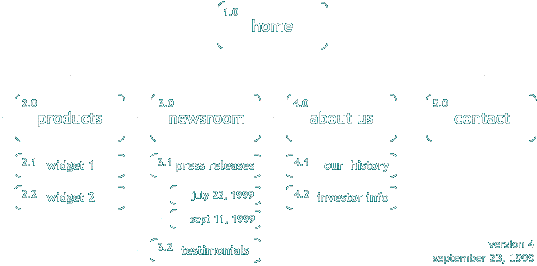
each box in the blueprint represents an actual page, and has a unique number that identifies it ("2.1", "2.2" etc). lines connecting boxes indicate the primary linking structure (additional links can be described in a site "script" or "paper prototype", both of which are page-by-page accounts of the site's content). the words used in the blueprint should reflect the actual text to be used on the site's interface.
a site blueprint gives a sense of the website as a whole, and helps you and the client visualize the structure of the content contained in the site. during production, you can use the blueprint as a guide to follow when you design the site's navigation and when you build each page. the blueprint, though, is really just a quick reference sheet...it is also wise to create a site script that lists, in full detail, the features of each of the pages shown in the blueprint, including:
like the scope document, the blueprint should be finalized with the client before production begins. keep track of changes to the blueprint by versioning the document. to produce your blueprints you may want to look into flowcharting software like visio or macflow/winflow.
setting up your working environment
during the making of your website you're going to accumulate a multitude of
files. in order to work efficiently, prevent version control problems, and deliver
a professional product to a client, you'll need to organize the assets you use
to create your site. if you're working as an independent and your jobs aren't
too big, you likely won't be using formal version control software (like microsoft's
visual source safe),
so the easiest way to keep track of everything is to come up with a consistent,
structured job folder that you use for every site you produce. over the years,
i've developed a structure i like to use that always varies, but usually starts
something like this:
here are some key things to note about the above structure: 1) never keep your original site designs (eg. your photoshop files) in the same place as the site you are creating. keep them in the artwork folder. 2) produce your flash movies in their own folder so the .fla files don't clutter up your site folder. 3) keep your site-in-progress separate from any site versions you deliver to the client. the delivery sites folder should *only* contain the versions of the site you have sent to the client. whenever you need to deliver a product to the client, move the files to the delivery sites folder, and date them. 4) keep all the images for your site in one folder, not sprinkled across all the folders that contain the pages they are used on.
creating a site skeleton
once you've reached a final site blueprint, and you have your job folder set
up, you can produce a working "skeleton" of the site that consists
only of hypertext links. here's an example
of what an initial site skeleton might look like. the skeleton lets you feel
what it's like to move around the site, and can help a client better understand
the blueprint and scope document. often a site skeleton can expose problems
in the site architecture that aren't obvious on paper, and *before* you've spent
hours working out the design of the interface. by moving around the sample above,
for instance, you may have felt the need to go directly to a specific press
release right from the "newsroom" page, rather than from the "press
releases" page. perhaps the "press releases" page itself is redundant.
also, there's a lot of clicking in our example. maybe the main sections should
be available from all pages. furthermore, when you navigate from investor info
to press releases, you have no way back to investor info. a site skeleton will
help you discover those nuances.
as you collect content for the site, it's a good idea to actually place it on the skeleton. in theory anyway, you shouldn't start designing the site until the skeleton is complete, including all finalized copy for the site. this lofty ideal can often break-down under tight deadlines, but it's worth fighting for--you'll have a much easier time making changes to copy and structure while the site still has no graphical skin. and clients will have a real deliverable they can examine and provide feedback on before the final site is produced.
file naming conventions
once you start actually building the site, you'll have to determine the names
you'll be giving the html and image files. here are some basic principles that
will get you started:
absolute and relative paths
all files on computers have addresses which indicate their locations. for example,
on a windows-based pc, a file called "resume.doc" located outside
of all directories on the computer's primary hard drive could be referred to
in writing like this: c:\resume.doc. the location of any file on
a computer is known as its "path". paths come in two flavours: absolute,
and relative. an absolute path describes the route you'd have to take (through
folders when necessary) to get to a file starting from the top level of the
device which contains the file (eg. "c:\applications\games\quake\help.html").
on the web, we use paths (or "addresses" or "urls") all the time to request pages in our web browser. for instance "www.moock.org/webdesign/lectures/week4.html" lists the path to the page you're reading now. the "www.moock.org" specifies the device on which the file physically resides (in this case, a web server), while "/webdesign/lectures/" indicates the folders that contain the file on that device; finally "week4.html" refers to the name of the file itself. this kind of path is known as an "absolute path" because it includes a reference to the device on which the file is located (the web server). in page building, you use paths as the value of the "HREF" attribute of the <A> tag to link between files. you can use absolute paths in links but only if the device in the path is accessible to the browser when the file is requested. when an absolute path refers to a webserver, we expect the device to always be available, so a link like this is perfectly fine:
<A HREF="http://www.moock.org/webdesign/lectures/week4.html">this
  week's notes</A>
however, some absolute paths contain references to devices that are only present when you're working on your computer locally:
<A HREF="file:///c|/data/sites/moock.org/webdesign/lectures/week4.html">this
  week's notes</A>
if you use absolute paths like that, your links will be broken when you post your pages to the web because your hard drive (the "c|") isn't accessible over the web.
so what do you do when you want to produce a site on your hard drive that will also work when you post it to the web? well, if you wanted to, you could use absolute paths of the "http://www.yourdomain.com" kind in all your links and then post your pages to your specified web server every time you wanted to view them. obviously that gets a bit tedious. also, you've got a lot of work on your hands if you ever want to move your pages to a new site because you'll have to change all the link references from the name of your old site to the name of your new one. so absolute paths generally aren't appropriate when you're linking to files on your own site (though you use them when linking to pages on other sites).
if you can't use absolute paths, what do you use instead? relative paths. relative paths let you specify the location of a file not in relation to a physical device (ie. a webserver, or your hard drive), but in relation to another file.
here's how relative paths work...suppose you have a page called widget.html in a directory called products and a page called help.html in a directory called support:

to link from the page widget.html to the page help.html,
you have to indicate not only the name of the page you're linking to (help.html),
and the name of the folder it lives in (support), but also its location
relative to widget.html, the file you're linking from.
to do that you use a special, easy to use syntax invented just for the purpose.
in our widget.html -> help.html example, the help.html
file lives in a directory one level above the widget.html file. a relative
path always describes the connection between the two files in the link by starting
with the file we're linking from (widget.html), so we first have to state
that /support/ is one folder up from our file's current location--we do that
using two periods and a slash, like this: ../ . next we
simply state the name of the folder in which the help.html file resides:
support . then we add another slash: /
. a slash divides the name of a folder from the name of the next folder or from
the name of a file. finally, we simply state the name of the file: help.html
. so the final relative path from widget.html to help.html looks
like this:
<A HREF="../support/help.html">view the
  help page</A>
to go up two directories, simply use "../../". for three, use "../../../", and so on.
now if the support directory had been located inside the products directory, we'd have had an easier time building the relative path. to link to files below the location of the current file, simply state the name of the first directory without any initial slash, then give the rest of the path as usual (eg. "support/help.html"). relative paths are recommended for all links and image SRC attributes in your site.
using tables for page layout
in week 3 you learned the basics of the table tag, and saw how tables could
be used to display data in rows and columns. when tables were first introduced
into html, they were pretty much only intended for that. but as soon as it became
possible to prevent the border of a table from showing, web designers stumbled
upon what has become one of the foundations of web design--tables can be used
to position content on the screen. because tables were never really intended
to perform the function of a layout tool, there have always been quirks with
the technique. however, through years of trial and error, designers eventually
arrived at some basic approaches that work in all browsers. before you dive
into learning them, remember that, theoretically anyway, using the table tag
to achieve page layouts is a misuse of the tag. as of the version 4 browsers,
the w3c recommends using css and absolute positioning to put your content where
you want it to go. it's worth keeping in mind over the next year or two as the
version 3 browsers start to really disappear. right now, though, if you want
to reach the broadest audience with your site, you'll have to continue to use
tables.
the famous left-hand navigation layout
you've seen it everywhere...the column of buttons down the left-hand side of
a webpage, the logo on top, and the content on the right. if you can't picture
it, look at this sample page. why, you
may wonder, is that layout so popular? here are a few reasons. 1) it's an entirely
practical limitation of the technology: because of the way background images
tile, the only place you can get a strip of colour to align itself flush with
the edge of the browser is on the left. 2) given the options, left-hand navigation
schemes are reasonably good interface design, from a usability perspective (in
other words, "it works"). 3) as the left-nav layout became popular,
more and more users ended up becoming familiar with it. once a user knows something,
they find it easier to navigate through. so designers who want a site that is
easy to navigate produce things that look like something the audience already
knows. (this is something like a path in a forest...repeated use of a trail
makes it familiar, and easy to follow because you know the terrain and recognize
the landmarks. heading out off the known path can get you lost and leave you
feeling confused). finally 4) now that there are established genres of sites
(eg. "portals" like lycos, excite, netscape, snap) designers often
use a known site layout so the users of a new site identify it with an existing
category.
so now you know why the left-hand nav is popular; let's see how to build it.
how to: building a page with left-hand navigation
<TABLE BORDER="1" CELLPADDING="0" CELLSPACING="0" WIDTH="100%">
<A HREF="test.html"><IMG SRC="b-linkone.gif" ALT="link one" WIDTH="100"
    HEIGHT="19" BORDER="0"></A><BR>

    <A HREF="test.html"><IMG SRC="b-linktwo.gif" ALT="link two" WIDTH="100"
    HEIGHT="19" BORDER="0"></A><BR>
one last note about table production: you may have noticed that the source code you've been looking at in the examples has comments in it that don't show up when you view the page in a browser. these can be handy ways of keeping your head straight when you're creating complex tables. to make a comment, use this special comment tag syntax: <!-- your note goes here -->
removing column and row walls in a
table
occassionally you'll do a layout that requires some content to stretch across
the borders of two or more rows or columns. to span content across either rows
or columns in a table, use the "COLSPAN" and "ROWSPAN" attributes
of the table cell (<TD>) tag. span columns by adding the COLSPAN attribute
to a <TD>, and specifying the number of columns you want to cross as the
COLSPAN value. span rows by adding the ROWSPAN attribute to a <TD>, and
specifying the number or rows you want to cross as the ROWSPAN value. just remember
not to define the other cells you are spanning--leave the spanned <TD>s
out of the row(s) affected by your COLSPAN or ROWSPAN. here's some example code
and the table it produces:
<TABLE BORDER="1" WIDTH="100%">

  <TR>

  <TD>this is a test of spanning columns and rows</TD>

  <TD>this is a test of spanning rows and columns</TD>

  <TD>this is a test of spanning rows and columns</TD>

  </TR>


  <TR>

  <TD COLSPAN="2">the content in this cell will cross the first
  two columns of the row.</TD>

  <TD ROWSPAN="2">the content in this cell will cross the bottom
  two rows of the table.</TD>

  </TR>


  <TR>

  <TD>this is a test of spanning columns and rows</TD>

  <TD>this is a test of spanning columns and rows</TD>

  </TR>

  </TABLE>
| this is a test of spanning columns and rows | this is a test of spanning rows and columns | this is a test of spanning rows and columns |
| the content in this cell will cross the first two columns of the row. | the content in this cell will cross the bottom two rows of the table. | |
| this is a test of spanning columns and rows | this is a test of spanning columns and rows | |
some other table-layout examples
once you've completed your first left-hand navigation table layout, you'll understand
quite a lot more about the power of tables, and the limitations web designers
are faced with in making an aesthetically pleasing page. tables are probably
the most thoroughly explored accident of web design ever. designers use them
for all kinds of crazy tricks...some practical, others experimental. just to
whet your appetite, here are four more common uses of tables as layout tools.
visit each link to take a look, and view the source to borrow the code for your
own pages.
an alternative to tables: frames
one of the early layout tools that was introduced into html to satisfy the needs
of designers engaged in the tag insanity of the table craze was called "frames".
frames allow you to slice up the browser window vertically or horizontally so
you can present more than one page at a time (each of the divisions you create
can contain a different page). each division, or "frame" can have
its own scroll bar. here's an example of
what a frames page can look like.
creating a frames page
a frames document consists of two components: 1) the page that describes the
layout of the frame structure, and 2) the pages that are displayed in the frames
themselves. there's nothing special about the pages that are displayed in the
frames...they're just normal web pages like you've already been making. however,
the page that describes the frame structure, or the "frameset page",
departs slightly from the basic html page skeleton. instead of using a <BODY>
tag to contain its content, the frameset page uses the <FRAMESET> tag.
so the skeleton for a frameset page would look like this (note the minor change
to the DOCTYPE which indicates which version of html we're using):
<!DOCTYPE HTML PUBLIC "-//W3C//DTD HTML 4.0 Frameset//EN"

  "http://www.w3.org/TR/REC-html40/frameset.dtd">
<HTML>

  <HEAD>

  <TITLE>a simple frames example</TITLE>

  </HEAD>
<FRAMESET>

  </FRAMESET>
<NOFRAMES>content here will be shown to non-frames browsers</NOFRAMES>
</HTML>
to create a frame structure, you specify your desired number of rows and columns using the "ROWS" attribute and the "COLS" attribute of the <FRAMESET> tag. a <FRAMESET> tag that looks like this:
<FRAMESET ROWS="50%,50%" COLS="50%,50%">
will produce a frames structure that includes two rows, each of which containing
two columns. the widths of the rows and columns are determined by the percentage
or pixel quantities specified as the values of the ROWS and COLS attributes.
if you want to let the browser decide how wide to make a row or column, specify
the pixel/percentage value as "*", eg. ROWS="150, *".
once you've got the frame structure defined with the <FRAMESET> tag, all
you need to do is specify the names of the pages that should go in each frame.
to do that, you use the <FRAME> tag (in much the same way you use the
<IMG> tag to embed an external image):
<FRAME SRC="page1.html">
the <FRAME> tag is placed between the <FRAMESET> start and end tags. for each column in every row of your frameset, you'll need a <FRAME> tag to tell the browser what page to display there. the <FRAME> tags in your document correspond to the frames displayed in the browser from left to right, one row at a time. so in a two row, two column frameset, the <FRAMESET> and <FRAME> tags might look like this:
<FRAMESET ROWS="50%,50%" COLS="50%,50%">
<FRAME SRC="page1.html">  <!--row
  1, column 1-->

      <FRAME SRC="page2.html">  <!--row
  1, column 2-->
    <FRAME SRC="page3.html">  <!--row
  2, column 1-->

      <FRAME SRC="page4.html">  <!--row
  2, column 2-->

  </FRAMESET>
getting rid of the frame borders
if you've looked at the example of the frames page above, you're probably already
wondering if there's anything you can do to get rid of the slightly unattractive
borders between the frames. the answer is "yes!". as soon as frames
were invented designers started clamouring for more visual control over them.
the result was the introduction of a whole whack of frame attributes that govern
the look of frame borders. over the years some attributes have been abandoned,
and others have differing results in netscape and internet explorer. rather
than go into exhaustive detail on the topic, i'll simply give you a sample frameset
that shows how to rid yourself of frame borders (if you want to kill the scrollbars
too, change SCROLLING="AUTO" to "SCROLLING="NO"):
<!DOCTYPE HTML PUBLIC "-//W3C//DTD HTML 4.0 Frameset//EN"

  "http://www.w3.org/TR/REC-html40/frameset.dtd">
<HTML>
<HEAD>

  <TITLE>your page title goes here</TITLE>

  </HEAD>


  <FRAMESET COLS="30%,70%" FRAMESPACING="0" FRAMEBORDER="NO"
  BORDER="0">

       <FRAME SRC="page1.html" FRAMEBORDER="0"
  BORDER="0"

        MARGINWIDTH="10" MARGINHEIGHT="10"
  SCROLLING="AUTO">
<FRAME SRC="page2.html"
  FRAMEBORDER="0" BORDER="0"

        MARGINWIDTH="10" MARGINHEIGHT="10"
  SCROLLING="AUTO">

  </FRAMESET>
<NOFRAMES>content here will be shown to non-frames browsers</NOFRAMES>
</HTML>
here's what the code above looks like in a browser.
linking between frames
if you're using frames to emulate the left-hand navigation we did with tables,
you're going to have to make the links from your navigation frame load into
the content frame. in order to tell the browser which frame you want your linked
page displayed in, you have to name each frame using the NAME attribute of the
<FRAME> tag. you could name a content frame "content" like this:
<FRAME SRC="nav.html" NAME="content">
then, to make a page display in that frame from a hypertext link, use the "TARGET" attribute of the <A> tag to specify its name, like this:
<A HREF="content.html" TARGET="content">link
  to content page</A>
some caveats to frames usage
if you're getting excited about using frames, be aware that they do not come
without their share of problems. normal navigation with the browser's back/forward
buttons can be awkward with frames. users can't bookmark specific pages displayed
in frames...they can only bookmark the frameset. and search engines have a hard
time collecting content from frames-based sites, so a frames site can often
be less visible on a search engine than it might have been as a non-frames site.
these and other problems with frames lead to an initial
backlash against them. frames aren't all bad, though, and they can make
for interesting sites when used with care and creativity. just be aware that
like most web technology, they just ain't perfect.
(copyright colin moock, fall 1999)