Version: Flash MX 2004
Date Added: February 11, 2005
This is the original English language version of an article commissioned by Macromedia Japan. The translated Japanese version is not yet available.
Here are the example files discussed in this article:
>> Download example files (338k)
This article explains how to completely change the graphical appearance of (i.e., "to skin") the V2 ProgressBar component. Before we begin, a warning: the techniques described in this article apply to the ProgressBar and to many other V2 components, but not to all. Some components require advanced skinning techniques not discussed in this article. For example, the Button component's skin, perhaps surprisingly, is primarily code-based. Skinning a Button component requires a thorough understanding of the Button skin code. Likewise, the specific steps required to skin components made up of multiple subcomponents, such as the DataGrid or the List, are not covered in this article. This article will help you get started with skinning and will give you the skills to skin many V2 components, but for some components you should expect to do further research (see "Further Study" at the end of this article for suggested resources).
The basics: styles versus skins
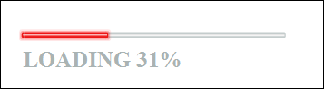
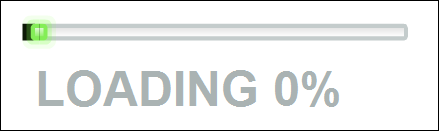
A component's appearance can be changed in two ways: 1) by setting the component's styles, 2) by skinning the component. Setting a component's styles means using code to change the component's colour and font without changing its graphics. For example, here is the default appearance of a ProgressBar component:
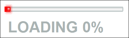
Figure 1. The default ProgressBar appearanceAnd here is what the ProgressBar component looks like with the "themeColor", "fontFamily" and "fontSize" styles set:
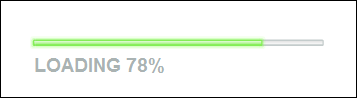
Figure 2. A styled ProgressBarHere is the code used to style the ProgressBar shown in Figure 2:
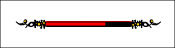
pBar.setStyle("themeColor", 0xFF0000);
pBar.setStyle("fontFamily", "Times New Roman");
pBar.setStyle("fontSize", 16);
In Figure 2, the ProgressBar's colour is now red instead of green and its text is set in Times New Roman instead of Verdana, but the basic graphical shapes of the ProgressBar are the same as they were in Figure 1. By setting a component's styles, we can gain some control over the appearance of the component, but when we need to change more than just colours and fonts we must skin the component. Skinning a component means replacing the component's graphics entirely, producing a completely new appearance for the component. For example, if we were creating an adventure game we might want to skin our game's ProgressBar to make it look like this:
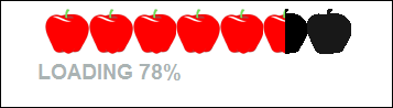
Figure 3. A skinned ProgressBarLater we'll examine how the above "adventure game" ProgressBar was made. But before we do, it's worth pointing out that not everything about the appearance of a component can be changed, even with skins. The internal display system of each component determines what aspects of the component's appearance can be changed. For example, the variable-width "load bar" section of the ProgressBar component shown in Figures 1, 2, and 3, is produced by stretching a thin graphic between the left and right side of the component. Because the graphic is stretched, it must be a simple, abstract shape not, say, a repeating image such as the apple shown in Figure 4.
Figure 4. A tiled V2 ProgressBar skinFilling a region with a repeated graphic like the apple in Figure 4 is known as "tiling". Tiled skins are not natively supported by the V2 ProgressBar. Hence, modifying a ProgressBar to look like the one shown in Figure 4 would require custom code and in-depth knowledge of the ProgressBar's own skinning implementation.
What, exactly, is a "skin"?
In interface-programming terms, the "skin" of a user interface is its graphical appearance, which is typically separated from code so that the interface can be changed visually without affecting the underlying logic.
Specifically, for a Flash V2 component, a "skin" is a collection of movie clips that contain the component's graphics. Each movie clip represents either an entire state of the component (e.g., enabled, disabled, pressed, etc) or a subsection of a particular state or states. For example, a skin movie clip might contain an entire disabled button face or just the arrow icon for a scrollbar. The skin is broken into multiple sections so that it can be assembled and resized at runtime in response to either user input or application logic.
Each movie clip in a skin has a specific Linkage Identifier that is used by the component to attach the movie clip to the Flash movie stage. Once on stage, the movie clips are positioned and scaled to produce the graphical appearance of the component.
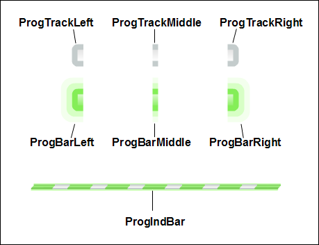
Figure 5 shows the skin movie clips for the ProgressBar component. The Linkage Identifier for each movie clip is shown in black text.
Figure 5. ProgressBar skin movie clipsAmong the various skin movie clips shown in Figure 5, those whose IDs begin with "ProgTrack" are the background of the ProgressBar while those whose IDs begin with "ProgBar" are the foreground of the ProgressBar--the part that stretches horizontally to indicate load progress. Both the "track" (background) and the "bar" (foreground) are made up of three separate sections: a left and right edge--the "caps" at the ends of the bar--and a middle section that stretches between the caps. When the ProgressBar is resized, the caps remain the same size and are placed at either end of the bar, while the middle section is scaled horizontally to fill the space between the caps. Finally, the ProgIndBar is a special graphic that animates between the left and right caps if the duration of the load operation being represented is unknown. The ProgIndBar movie clip is only used when the ProgressBar instance's
indeterminateproperty is set to true.Changing the skin of a single instance
As we've just seen, a component's skin is made up of graphics stored in movie clips (well...that's generally true, but some component skins are made of movie clips that link to ActionScript 2.0 classes instead of containing graphics). To change a skin, then, we need to tell the component to render itself using our own, customized movie clips instead of its default set. There are two ways to tell the component to use our movie clips instead of its own:
- change which Linkage Identifiers the component uses when attaching its skin movie clips
- set the Linkage Identifiers for our custom movie clips to match the Linkage Identifiers used by the component (in other words, override the component's default skin movie clips)
The first option requires more work, but lets us skin a component on a per-instance basis. The second option is easier to implement, but forces every instance of the component being skinned to use the custom skin. Let's take a look at both options, starting with changing the Linkage Identifiers a component uses when attaching its skin movie clips.
The V2 components store the Linkage Identifiers for their skin movie clips in so-called "skin properties". For example, the Linkage Identifiers for the ProgressBar component (as shown in Figure 5) are stored in the following properties: ProgressBar.progTrackLeftName, ProgressBar.progTrackMiddleName, ProgressBar.progTrackRightName, ProgressBar.progBarLeftName, ProgressBar.progBarMiddleName, ProgressBar.progBarRightName, ProgressBar.progBarIndName. We can change which movie clips a component instance uses for its skins by setting its skin properties. Let's see how this works by making a progress bar with a black square for its track's left cap instead of the default rounded grey left cap. Admittedly, this is a boring skin but it demonstrates the general principle. We'll make a more interesting skin later. Follow these steps:
- Create a new Flash document (.fla file).
- On Frame 1, Layer 1 drag a ProgressBar component to the stage.
- Create a new movie clip symbol named Square.
- In the Square movie clip, draw a small square shape 4 pixels wide and 4 pixels high. Position the shape with its top left corner at the Square symbol's registration point as shown (greatly magnified) in Figure 6.
Figure 6. The Square movie clip symbol
- Select the Square movie clip symbol in the Library
- On the Library panel's pop-up options menu (top-right), select Linkage...
- On the Linkage Properties dialog, for Identifier, enter "SquareSymbol".
- Click OK to accept the Linkage Properties settings.
- With the ProgressBar component instance selected on stage, add the following code to the Actions panel:
onClipEvent (initialize) { this.progTrackLeftName = "SquareSymbol"; }- Export the movie using Control > Test Movie. The ProgressBar component should look like the one in Figure 7 (again greaty magnified to show the new skin). Note the black square on the left side of the bar.
Figure 7. A new ProgTrackLeft movie clipThe preceding steps describe how to modify the skin of a component instance placed on stage manually in the Flash MX 2004 authoring tool. We changed the skin of the component by setting the progTrackLeftName property within the component's "initialize" event. But if we had created the instance with code at runtime, we would not be able to use onClipEvent() as we did in Step 9. Instead, we would use the createClassObject() method's initObj parameter to set the skin property on the new component instance. The following code does just that; it creates a ProgressBar instance at runtime with createClassObject() and uses the initObj parameter to set the progTrackLeftName property to "SquareSymbol". The result is exactly the same as that shown in Figure 7.
import mx.controls.ProgressBar;
this.createClassObject(ProgressBar, "pBar", 0, {progTrackLeftName:"SquareSymbol"});
Where to find a component's skin properties
As we've just seen, in order to skin a component we can assign new movie clip Linkage Identifiers to its skin properties. But how do determine which skin properties a component uses? There are two options.
First, we can look in the Flash MX 2004 Help files. The so-called "ellipsis" release of the Flash authoring tool (Version 7.2) contains updated Help files that include the skin properties for all V2 components. For each component, the skin properties are listed in the following location:
- Using Components > Components Dictionary > [component name] component > Customizing the [component name] component > Using skins with the [component name] component
For example, the skin properties for the ProgressBar component are listed here:
- Using Components > Components Dictionary > ProgressBar component > Customizing the ProgressBar component > Using skins with the ProgressBar component
Alternatively, we can find the skin properties for a component by looking at the component's class source code. The component classes are located in the Flash MX 2004 application folder, in the following directory:
- Windows: \Program Files\Macromedia\Flash MX 2004\[LANGUAGE_CODE]\First Run\Classes\mx\controls
- Macintosh: HD/Applications/Macromedia Flash MX 2004/First Run/Classes/mx/controls
For example on an English language Windows system, the ProgressBar component's class is located here:
- \Program Files\Macromedia\Flash MX 2004\en\First Run\Classes\mx\controls\ProgressBar.as
Within that file we can find the following skin property definitions:
var progTrackLeftName:String = "ProgTrackLeft";
var progTrackMiddleName:String = "ProgTrackMiddle";
var progTrackRightName:String = "ProgTrackRight";
var progBarLeftName:String = "ProgBarLeft";
var progBarMiddleName:String = "ProgBarMiddle";
var progBarRightName:String = "ProgBarRight";
var progIndBarName:String = "ProgIndBar";
However, locating the skin properties in the source code for a component's class can be difficult because the code is often not thoroughly commented and the skin property names do not follow a single naming convention. Some skin property names end with the word "Skin", as in "Button.trueUpSkin"; some skin property names end with the word "Icon", as in "RadioButton.falseOverIcon", while still others follow no convention at all, as in "NumericStepper.upArrowDisabled". Hence, the easiest way to determine the skin properties for a class is through the Flash MX 2004 Version 7.2 updated documentation.
No matter how you find a component's skin properties, once you know them you can skin the component by setting those properties to the Linkage Identifiers of your own custom skin movie clips.
Creating skins that can be coloured with styles
In our earlier SquareSymbol example, we replaced a ProgressBar instance's left track cap with a black square. In the example, we permanently set the colour of the square to black--any attempt to change the colour of the left track cap to red using styles would now fail. However, with a single line of code, we can make a skin's colour alterable with styles. Using the same document we created earlier, follow these steps to see how it works:
- Select the ProgressBar instance on stage.
- In the Properties panel, set the ProgressBar's instance name to "pBar".
- Edit the Square movie clip symbol.
- Select the shape inside the Square movie clip.
- From the Modify menu, choose Convert to Symbol.
- For the symbol Name, enter "SquareShape". For Behavior, choose "Movie clip".
- Edit the SquareShape movie clip symbol.
- Rename Layer 1 to "graphic".
- Add a new Layer to the SquareShape movie clip and name it "actions".
- Select Frame 1 of the actions layer.
- In the Actions panel, enter the following code:
mx.skins.ColoredSkinElement.setColorStyle(this, "themeColor");That code registers the skin movie clip as a styleable skin element. As a result, it will change colour when the "themeColor" style is set.- Return to the main document timeline.
- Select Frame 1.
- In the Actions panel, enter the following code to set the ProgressBar theme colour to red:
pBar.setStyle("themeColor", 0xFF0000);- Export the movie using Control > Test Movie. The ProgressBar component should look like the one in Figure 8 (again magnified to show the new skin). Notice that the left track cap is now red because it is registered to change colour when the "themeColour" style is set..
Figure 8. A styled custom skin
A detailed look at styleable custom skins is outside the scope of this article, but Figure 8 should give you a sense of what's possible. For more information on associating skins with colour styles, see the following document in the Flash MX 2004 Version 7.2 updated Help: Using components > Customizing components > About skinning components > Linking skin color to styles.
Changing the skin of all instances in a document
So far our SquareSymbol example has shown how to change the left track cap of a single ProgressBar instance only. To change the left track cap of all ProgressBar instances in a document we have several options. We can:
We'll examine the first two techniques in this article; for information on subclassing component classes see the resources under Further Study.
- set the progTrackLeftName property on the ProgressBar class's prototype
- use the default Linkage Identifier for our custom left track cap movie clip
- set the progTrackLeftName property in a ProgressBar subclass
Here's an example of the first technique, setting the progTrackLeftName property on the ProgressBar class's prototype:
import mx.controls.ProgressBar;
ProgressBar.prototype.progTrackLeftName = "SquareSymbol";
That code tells the ProgressBar class to use the SquareSymbol movie clip when creating any ProgressBar component's left track cap. If the above code appears on frame 1, then all ProgressBar instances placed on frame 2 or later will be affected. That said, it is still possible to customize the left track cap for any single instance. To customize a single instance, we follow the exact steps we studied earlier in the SquareSymbol example--using onClipEvent(initialize) (for author-time instances) or createClassObject()'s initObj parameter (for runtime instances) to set the instance's progTrackLeftName property to the desired movie clip. For example, to apply a triangular cap to a single ProgressBar instance we would use the following code (assuming we had also created a triangle movie clip and given it a Linkage Identifier of "TriangleSymbol"):
onClipEvent (initialize) {
  this.progTrackLeftName = "TriangleSymbol";
}
Now let's consider the second technique for changing the left track cap of all ProgressBar instances in a document--using the default Linkage Identifier for our custom left track cap movie clip. We'll start by determining the default Linkage Identifier for the skin movie clip we want to customize, and then we'll assign that Linkage Identifier to our own custom skin movie clip, overriding the component's default skin. Let's return to the document we created earlier and follow these steps to see how it works:
- On the main timeline, select the on-stage ProgressBar instance.
- Delete all code from the Actions panel.
- Open the following document in the Flash MX 2004 Version 7.2 updated Help:
- Using Components > Components Dictionary > ProgressBar component > Customizing the ProgressBar component > Using skins with the ProgressBar component
- In the skin-property table, under the Description column for the progTrackLeftName property, find the property's "default value". The "default value" is the default Linkage Identifier for the left track cap skin movie clip. In our case, it's "ProgTrackLeft".
- Change the Linkage Identifier for the Square movie clip symbol to "ProgTrackLeft". Note that case sensitivity matters! Make sure to use a capital P, T, and L when setting the Linkage Identifier.
- Export the movie using Control > Test Movie. The ProgressBar component should once again look like the one in Figure 7.
Because we set the Square symbol's Linkage Identifier to match the ProgressBar's default Linkage Identifier for the left track cap skin, the ProgressBar uses our Square instead of its own skin. If a document's Library contains a movie clip exported with the same Linkage Identifier as a component's internal skin movie clip, then the document's movie clip overrides (i.e., is used instead of) the component's internal movie clip.
Overriding a component's skin movie clip is an attractive way to skin components, especially for designers, because it involves no code whatsoever. However, for a complicated component, creating skin movie clips and assigning Linkage Identifiers can be time consuming. Fortunately, we can use so-called "themes" to reduce the labour required to override the skin of every component instance in a document.
Themes
A "theme" is a collection of skin movie clips and code used to change the appearance of the entire set of V2 components. Each theme is contained within its own .fla file. Macromedia provides two themes with Flash MX 2004, each of which offers its own graphical look for the V2 components. The default theme used by the V2 components is the Halo theme, which resides in a file named HaloTheme.fla in the following location:
- Windows: \Program Files\Macromedia\Flash MX 2004\[LANGUAGE_CODE]\Configuration\ComponentFLA\HaloTheme.fla
- Macintosh: HD/Applications/Macromedia Flash MX 2004/Configuration/ComponentFLA/HaloTheme.fla
The other theme supplied by Macromedia is known unceremoniously as "Sample Theme". It resides resides in a file named SampleTheme.fla in the following location:
- Windows: \Program Files\Macromedia\Flash MX 2004\[LANGUAGE_CODE]\Configuration\ComponentFLA\SampleTheme.fla
- Macintosh: HD/Applications/Macromedia Flash MX 2004/Configuration/ComponentFLA/SampleTheme.fla
Creating custom themes and using the supplied themes is not our focus here; we're interested in themes only because they supply us with the skin movie clips we need to override a component's skin, complete with the correct default Linkage Identifiers!
Here's how it works. Each theme has an entire set of skin movie clips for every available V2 component. To skin a component in a new document, we simply copy the component's skin movie clips from one of the supplied themes into the new document, then alter the graphics as desired. PRESTO! Our new skin will automatically be applied to all component instances in the new document.
Let's use this "copy-from-theme" approach to build the adventure-game ProgressBar example shown earlier in Figure 3. But as we build the example, remind yourself that this technique works only with components that use graphics-based skins. As we learned earlier, components that are nested or use code-based skins require advanced techniques that are not covered here, but can be found in the Flash MX 2004 Version 7.2 help.
The adventure-game ProgressBar example
Earlier we skinned the left track cap of a ProgressBar but we didn't actually use the ProgressBar to show any load progress. This time we'll link our adventure-game-style ProgressBar to a Loader component so that we can see it in action.
Before we start, here's warning to heed when using ProgressBar with Loader: when a ProgressBar's mode property is set to "event" (the default) it won't broadcast complete() or progress() events. If you want to register for events from a ProgressBar make sure its mode is set to "polled" or "manual". If you are using the ProgressBar in "event" mode then you should register for events with the ProgressBar's source rather than with the ProgressBar itself.
Bearing that warning in mind, follow these steps to create a ProgressBar linked to a Loader component:
- Create a new Flash document (.fla file) named skinnedV2ProgressBar.fla.
- Rename Layer 1 to "assets".
- Create a new layer and name it "scripts".
- On Frame 1 of the assets layer drag a ProgressBar component to the stage.
- In the Properties panel, set the ProgressBar component's instance name to "pBar".
- On Frame 1 of the assets layer drag a Loader component to the stage.
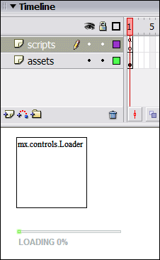
- In the Properties panel, set the Loader component's instance name to "loader". Your document should now look like the one shown in Figure 9.
Figure 9. The document timeline and stage
- Finally, select Frame 1 of the scripts layer and add the following code to the Actions panel:
// Make the load bar red.
pBar.setStyle("themeColor", 0xFF0000);
// Tell the ProgressBar to show progress for the Loader.
// (The source property specifies the object for which
// load progress will be displayed.)
pBar.source = loader;

// Load an image into the Loader.
loader.contentPath = "http://marsrovers.jpl.nasa.gov/gallery/press/spirit/"
                   + "20050113a/site_A89_CY_navcam_360_cyl-A365R1.jpg";
Our ProgressBar is now fully functional. Let's get skinning.
First, we need to copy the ProgressBar skin assets from the HaloTheme.fla file to our document's Library. Follow these steps:
- Select File > Import > Open External Libary.
- Open HaloTheme.fla, which is in the following location:
- Windows: \Program Files\Macromedia\Flash MX 2004\[LANGUAGE_CODE]\Configuration\ComponentFLA\HaloTheme.fla
- Macintosh: HD/Applications/Macromedia Flash MX 2004/Configuration/ComponentFLA/HaloTheme.fla
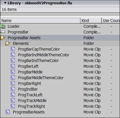
- With both the skinnedV2ProgressBar.fla Library and the HaloTheme.fla Library open, drag the following folder from HaloTheme.fla to skinnedV2ProgressBar.fla's Library: Flash UI Components 2 > Themes > MMDefault > ProgressBar Assets
Your skinnedV2ProgressBar.fla Library should now look like the one shown in Figure 10.
Figure 10. The Library with ProgressBar assets
In the Elements folder (shown in Figure 10), you should recognize the following symbols as the ProgressBar skin movie clips (shown earlier in Figure 5): ProgBarLeft, ProgBarMiddle, ProgBarRight, ProgIndBar, ProgTrackLeft, ProgTrackMiddle, and ProgTrackRight. Those symbols are the movie clips that you would normally redesign when skinning the ProgressBar.
In addition to the skin movie clips from Figure 5, the Elements folder also contains a series of symbols whose names end with "ThemeColor": ProgBarCapThemeColor, ProgBarIndMiddleThemeColor, ProgBarIndThemeColor, and ProgBarMiddleThemeColor. Those movie clips contain the raw shapes for the caps and middles of the ProgressBar's track (background), load bar (foreground), and indeterminate bar (animated bar that indicates an unknown load progress). The raw shapes are contained by the "ThemeColor" movie clips so that they can be associated with a style (exactly like we saw earlier under "Creating skins that can be coloured with styles"). Each "ThemeColor" movie clip contains the following single line of code, which causes its colour to change when the "themeColor" style is set:
mx.skins.ColoredSkinElement.setColorStyle(this, "themeColor");Finally, the ProgressBar Assets folder itself contains a single movie clip symbol named ProgressBarAssets. That symbol simply forces the ProgressBar skins to export with the movie.
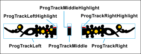
For our purposes, we're only interested in skinning the track (background) of the ProgressBar, so we'll only need to change the following movie clips: ProgTrackLeft, ProgTrackMiddle, and ProgTrackRight. In addition to changing those movie clips, we'll also create three new movie clips to contain our track's highlight shapes: ProgTrackLeftHighlight, ProgTrackMiddleHighlight, and ProgTrackRightHighlight. We place the highlight shapes in movie clips so that we can associate them with the "themeColor" style (i.e., so that they change colour whenever the "themeColor" style is set). The highlight movie clips are nested inside the track movie clips.
Figure 11 shows the completed skin movie clips for our ProgressBar skin.
Figure 11. Adventure-game ProgressBar skin movie clips
Notice that the ProgTrackMiddle movie clip has a transparent (i.e., 0% alpha) shape just above the ProgTrackMiddleHighlight movie clip. The transparent shape forces the track's middle section to line up with the left and right caps. Transparent shapes are often used to force proper alignment in graphical component skins.
Now follow these steps to apply the adventure-game style skin to the ProgressBar in skinnedV2ProgressBar.fla.
- Edit the ProgTrackLeft movie clip and delete everything on its stage (you may have to unlock layers to do so).
- Delete all but one of the layers in ProgTrackLeft's timeline.
- Rename the remaining layer "graphic".
- Draw a shape like the one shown for ProgTrackLeft in Figure 11. Make sure to place all graphics below, and to the right of, the symbol's registration point (i.e., the registration point should be at the top-left corner of the graphic).
- Draw a shape like the one shown for ProgTrackLeftHighlight in Figure 11.
- Select the ProgTrackLeftHighlight shape.
- Convert the ProgTrackLeftHighlight shape to a movie clip by choosing Modify > Convert to Symbol.
- On the Convert to Symbol dialog, for Name, enter ProgTrackLeftHighlight, then click OK.
- Edit the ProgTrackLeftHighlight symbol.
- Rename Layer 1 to "graphic".
- Create a new layer and name it "actions".
- Select Frame 1 of the actions layer.
- Add the following code to the Actions panel:
mx.skins.ColoredSkinElement.setColorStyle(this, "themeColor");- Repeat steps 1 to 11 to create the ProgTrackMiddle and ProgTrackRight movie clips, substituting the appropriate graphics and symbol names from Figure 11. Remember to include the transparent shape above ProgTrackMiddleHighlight in ProgTrackMiddle.
And that's it! The adventure-game ProgressBar skin is done. Choose Control > Test Movie to see it if worked. If it didn't work, try comparing it with the downloadable example file provided at the beginning of this article.
Bonus Round! A Button Skin
Well, we're done what we set out to do, but I just can't bear to leave the skinning-a-button issue unresolved.
The warning at the beginning of this article pointed out that the Button component is surprisingly difficult to skin because its skin is made up of code, not graphics. As a last exercise, then, let's take a quick look at an alternative approach: skinning SimpleButton instead of Button.
The SimpleButton class is the superclass of Button, and is accordingly less complex. Specifically, SimpleButton instances cannot be resized and do not have text labels--which makes them easy to skin. Follow these steps to skin a SimpleButton instance (or see skinnedSimpleButton.fla in the downloadable example files):
- Create a new Flash document (.fla file).
- Drag a Button instance to the stage and then delete it. This adds the Button component to the document Library.
- Create four movie clips, named up, over, down, and icon, with Linkage Identifiers set to "up", "over", "down", and "icon", respectively.
- In the up movie clip, create a graphic that represents the button in an idle state.
- In the over movie clip, create a graphic that represents the button when the mouse pointer is above it.
- In the down movie clip, create a graphic that represents the button when it is pressed.
- In the icon movie clip, create a graphic that will appear in the middle of the button in all states.
- Select Frame 1, Layer 1.
- Add the following code to the Actions panel:
import mx.controls.*; var initObj = {falseUpSkin:"up", falseDownSkin:"down", falseOverSkin:"over"}; initObj.falseUpIcon = "icon"; initObj.falseDownIcon = "icon"; initObj.falseOverIcon = "icon"; initObj.trueUpIcon = "icon"; initObj.trueDownIcon = "icon"; initObj.trueOverIcon = "icon"; // Cast the object returned by createClassObject() to SimpleButton. var sButton:SimpleButton = SimpleButton( this.createClassObject(SimpleButton, "sButtonInstance", 0, initObj)); sButton.move(250, 200);- To export the movie, choose Control > Test Movie.
In the preceding steps, we created the SimpleButton instance with code (via createClassObject()) because there is no SimpleButton visual component included in the Flash MX 2004 Components panel. It is theoretically possible to subclass SimpleButton and use the subclass to create a component that could be added to the Components panel, but doing so is outside the scope of this article. For information on creating components, see Further Study, below.
The SimpleButton class is not the only alternative to the Button component. The CustomButton class can also be skinned with graphical movie clips. CustomButton offers the additional features of resizability and a text label. Note, however, that a CustomButton instance can be resized along one axis only--either horizontally or vertically. Accordingly, the CustomButton skin is structured much like the ProgressBar skin; it has two end caps for the edges of the button and a middle section that is stretched between the caps. You can use the SimpleButton skinning technique described above to skin a CustomButton instance. Of course, you'll have to use the CustomButton skin properties instead of the SimpleButton skin properties. For reference, here is a list of CustomButton's skin properties:
- falseUpSkinL
- falseUpSkinM
- falseUpSkinR
- falseDownSkinL
- falseDownSkinM
- falseDownSkinR
- falseOverSkinL
- falseOverSkinM
- falseOverSkinR
- trueUpSkinL
- trueUpSkinM
- trueUpSkinR
- trueDownSkinL
- trueDownSkinM
- trueDownSkinR
- trueOverSkinL
- trueOverSkinM
- trueOverSkinR
- falseDisabledSkinL
- falseDisabledSkinM
- falseDisabledSkinR
- trueDisabledSkinL
- trueDisabledSkinM
- trueDisabledSkinR
In the preceding property names, "false" means that the button is not in a "toggled on" state, while "true" means that the button is in a "toggled on" state. Non-toggle buttons (i.e., normal buttons) use the "false" skins only. The letter "L" means left cap, "M" means middle, stretching section, and "R" means right cap.
Note, however, that rather than relying on the above list of CustomButton skin properties you should always consult the actual source code for the CustomButton class to verify which skin properties it supports. Different versions of the class may support different properties. The source code also contains a brief description for each skin element. The source file for CustomButton is located here:
- Windows: \Program Files\Macromedia\Flash MX 2004\[LANGUAGE_CODE]\First Run\Classes\mx\controls\CustomButton.as
- Macintosh: HD/Applications/Macromedia Flash MX 2004/First Run/Classes/mx/controls/CustomButton.as
Normally you would be able to find more information in the Macromedia Flash documentation, but neither the CustomButton class nor the SimpleButton class are included in the current Macromedia Flash MX 2004 documentation. See also Nigel Pegg's blog post on the subject of skinning buttons. Nigel is one of the original creators of the V2 component set.
Further Study
For more information on skinning and customizing the V2 components, see the following resources:
- Skinning the Flash MX 2004 Components
- Flash MX 2004 Version 7.2 updated Help: Using Components > Customizing Components > About Skinning Components
- Building and Testing Components in Macromedia Flash MX 2004
- Flash MX 2004 Version 7.2 updated Help: Using Components > Creating Components